
 )
)Responsive Website Design
Responsive web design (RWD) is a method of designing websites to provide easy reading and navigation with the least amount of resizing, scrolling and panning on internet connected devices ranging from desktop computer screens to tablets and mobile phones.
Your website will be viewed on and must clearly work on many different screen sizes and operating systems (Windows, Android & Apple). It is not possible to have a set design for every screen size as there are simply too many of them in use.
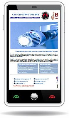
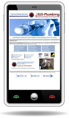
We will design for you a site designed that is responsive and scaleable to each screen size or device. You can see an example of how your site would look on a PC screen and a phone below.

|

|
Note on the mobile phone version the menu has automatically changed to a more touch friendly version. It is also important to note that if you want set box sizes or special unusual fonts, these items may not appear correctly on every device. A common mistake is to make a site look perfect on your own computer screen without thinking how it will look on all internet devices it is viewed on.
Non - Responsive Design
A non-responsive design would end up looking like the examples on the right on a tablet or mobile phone.
As you can see either the site is very small or parts of it are missing from the screen, so you have to pan and scroll around to see the whole site.